


Bottle labels
- phoeberoosen
- Jul 4, 2018
- 2 min read
Whilst location isn't prevalent in the viewing of wine bottles, I just so happened to be in Jersey when I took particular notice of the following labels.
I've always appreciated which bottles caught my eye more than others, and noted which aspects I was particularly drawn to.

In this image I quite liked the hand drawn element to the typography as well as the very typographic base to the design. As it's so busy to look at it draws your attention alongside perhaps more elegant and controlled design. The red and white marks a bold contrast too, adding to the emphasis that is created.

I feel I was drawn to this design because of the large distorted lettering which I have favoured in past designs. The cutout of this shape allows you to see inside the bottle in an intriguing way, embodying the natural colours within the product into the design.

I liked this design because of its illustrative element, which demonstrates the use of different techniques and their outcomes within this area of design. I think this label was partially foiled in some areas also, which brought further emphasis to this particular design amongst other labels.

I liked this design for the abstraction of colours, illustrating that the labels do not always have to be specific to the content of the product, with abstraction working equally as well. This simple technique would be fairly easy to replicate and I imagine quite enjoyable- perhaps try something like this? Pattern making, symmetry, etc.

Although not immediately clear in this picture I think this design uses an element of embossing/debossing which I was introduced to last year, another element for emphasis. The unique typography creates a sense of personality which coincides with the illustrative content, establishing a firm sense of brand identity.
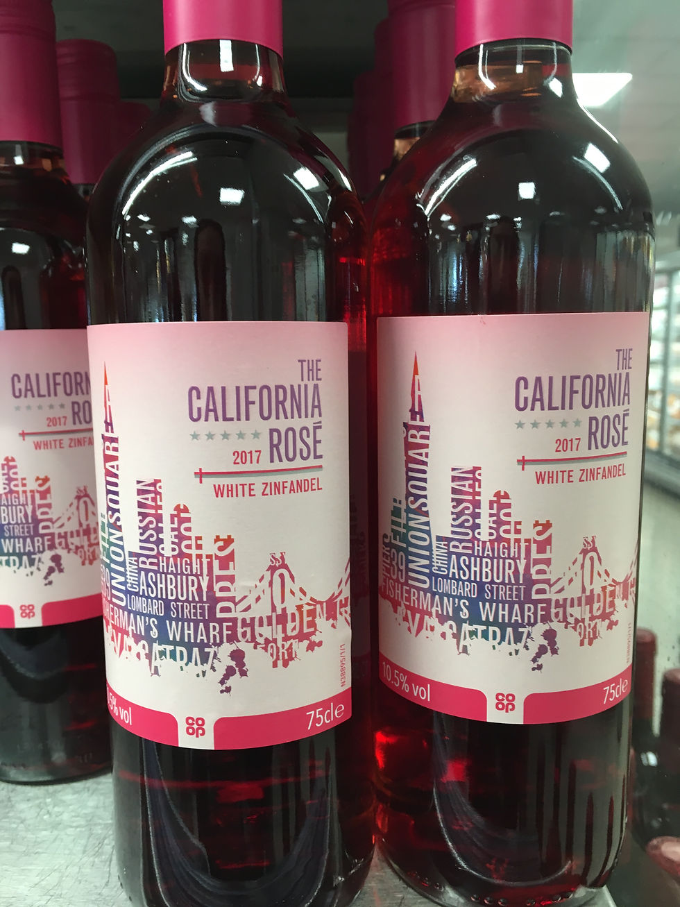
Once again I chose this one for the typographic basis, which has been carefully manipulated into an image of a skyline. The colours chosen reflect those within the product, with rosy pinks present throughout. Choosing colours according to content seems like a logical yet overlooked thing to do, though ultimately very effective. The slight ombre tinge at the top of the label is also a nice touch.
Comments